How To Take Better Photos Of Your Artwork
One thing I’ve learned over the years is that a lot of artists accidentally undersell their own work because the photos simply don’t do it justice.
I’ve seen genuinely brilliant artwork look amateur online because the image was blurry, dark, oversaturated, photographed under terrible lighting or at a bad angle, or uploaded at a tiny resolution that it was basically a thumbnail stretched to extremis.
I empathise though, as photographing artwork can be frustrating. It’s surprisingly difficult to make a physical piece feel the same digitally as it does in real life, especially if there’s texture, subtle colours, metallics or micro detail involved.
The good news I always say when artists ask for help, is that you don’t need expensive camera equipment anymore. Most modern phones are more than capable of taking excellent photos of artwork if the setup and lighting are right.
I have spent years working with tens of thousands of artists’ digital work through both Cards by Simon and Wraptious, and see the same problems appear again and again, that I thought I’d share the biggest things I’d recommend focusing on.
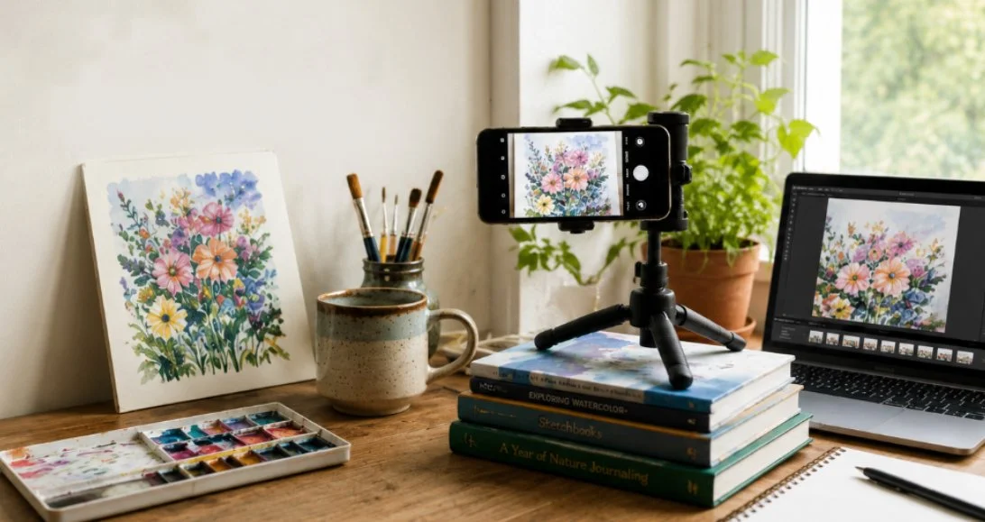
No fancy equipment needed - sometimes a book and natural window light is enough.
1) Resolution Matter More Than Most People Realise
This is probably the single biggest issue I come across.
Always upload or send the highest resolution version of your image that you have. Many artists accidentally send screenshots, Facebook uploads or images previously shared through apps like WhatsApp. The problem is those platforms massively compress images into thumbnails without people realising. What looks ok on a phone screen can end up blurry, pixelated, or unusable once printed properly or viewed larger on a monitor.
I’ve seen fantastic artwork let down so many times by tiny compressed images, often after being processed through a social media app.
It’s also worth checking your phone settings because many phones do not automatically photograph at their highest resolution. Some reduce file sizes by default to save storage space.
If in doubt:
Use the original photo directly from your camera roll;
Avoid screenshots;
Avoid social media downloads;
Avoid images forwarded through messenger apps.
You can always make a larger image smaller later, but you can’t magically create detail or re-enlarge an image, when that detail has already been lost.
2) Lighting Is Everything
Lighting is far more important than owning an expensive camera.
A decent phone camera in good natural light, will usually produce a much better image than a fancy camera used badly.
The ideal setup is normally near a window (or even outside) on a bright but cloudy day. Cloud cover acts like a giant softbox and helps avoid harsh shadows and glare. Direct sunlight tends to create strong reflections, blown-out highlights and uneven colours.
Indoor lighting is often the real killer, with warm ceiling bulbs massively shifting colours and making whites look yellow or muddy. I’ve seen artwork photographed under kitchen spotlights that barely resembled the original piece at all. If possible, turn indoor lights off and use natural daylight instead.
And if your artwork has texture - thick paint, embroidery, lino print, collage, anything tactile really - try experimenting with the light coming from an angle rather than straight on. Sometimes positioning the artwork roughly 45 degrees to the light source helps the texture stand out beautifully.
3) Keep The Camera Straight And The Artwork In Focus
A huge amount of artwork online is photographed slightly wonky, distorted or only half in focus. Even when people can’t immediately explain what’s wrong, they notice something isn’t quite right.
Try to position the camera square-on to the artwork rather than shooting from above or from the side. Taking an extra minute getting things straight now saves loads of frustration later when editing and cropping.
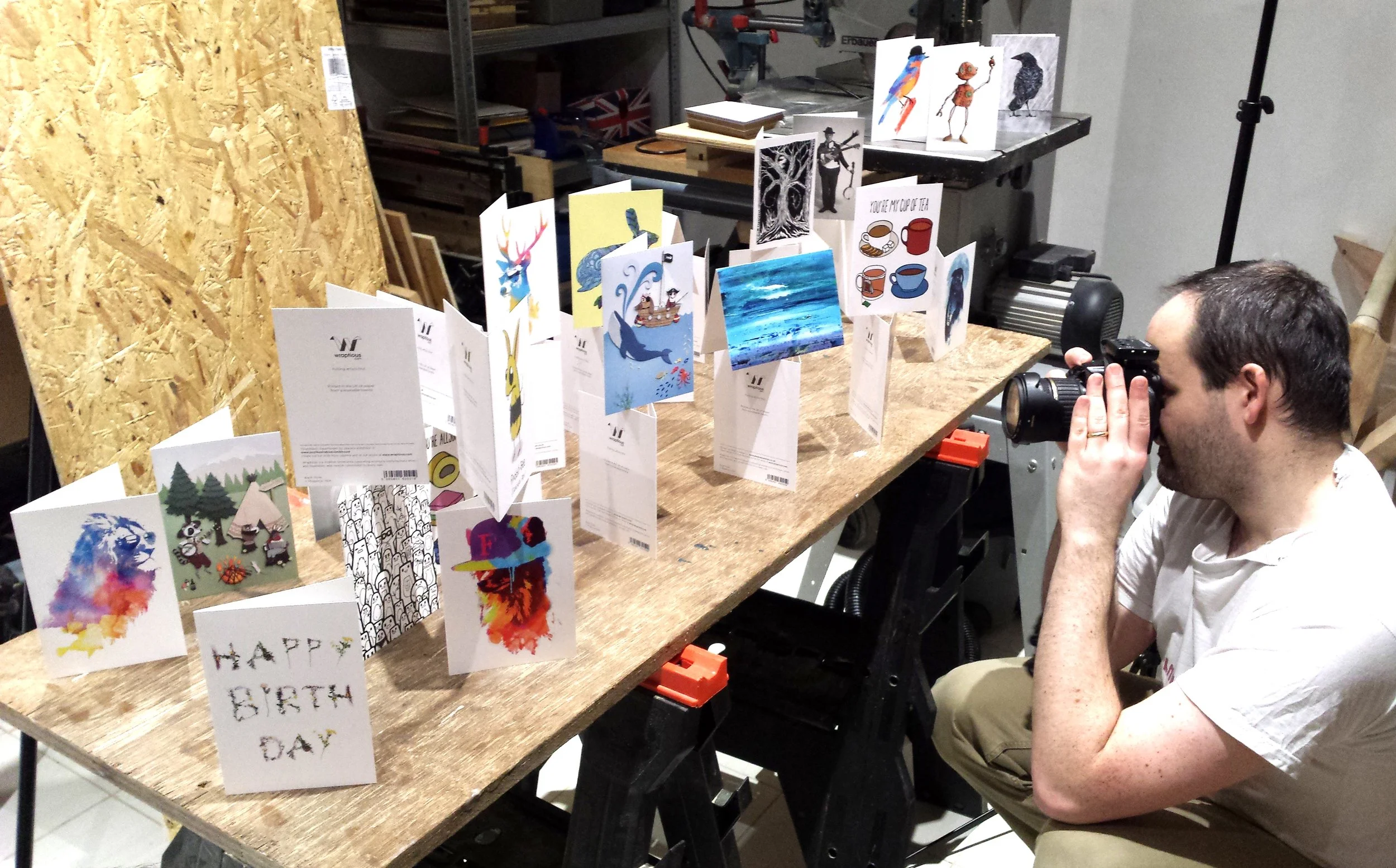
Having fun photographing cards
It’s also worth stepping slightly further back than feels natural. Getting too physically close with a phone camera can distort the edges of artwork slightly, especially on wider lenses. And make sure the whole artwork is sharp and in focus, not just the middle (stepping back helps with this too). Some phones now automatically blur backgrounds or edges aggressively which can look great for portraits but awful for artwork.
It’s worth me mentioning that flat-textured artwork often scans better too, especially if it fits comfortably on a scanner. Scanning usually gives more accurate colours and sharper detail than photographing, particularly for prints, drawings, and flat paintings. I’ll probably write a separate post about scanning properly in future.
4) Reflections Will Drive You Mad :)
Reflections are one of the most annoying parts of photographing artwork, depending on the medium you use.
Framed pieces, glossy prints, varnished paintings or metallic paints can all suddenly turn into mirrors the second you point a camera at them! It’s normal to often spend more time awkwardly moving yourself around the room trying not to appear in the reflection than actually taking the photo. (This also has an impact on shadows too, which is why the above lighting advice is really importat).
Usually the fix is simple though - moving the artwork or yourself slightly; changing the angle of the light a little. Tiny adjustments often make a huge difference. Or of course, removing artwork from cello or a frame before photographing. It does happen!
Finally, before taking the photo, clean the artwork properly too. Dust, hairs, fingerprints, smudges and random bits of fluff become weirdly visible once viewed on a large screen.
5) Keep Everything Still
You don’t necessarily need a tripod, but stability helps massively. Even tiny movements can soften detail slightly, especially indoors where phones sometimes use slower shutter speeds automatically.
If you don’t own a tripod, you can improvise with books, mugs, boxes etc. Get creative! As long as you can keep your phone still when taking the photo, it can make a huge difference.
Using the timer function on your phone, alongside stability, really helps too. Pressing the button to take a photo can create a tiny wobble and make your photo less sharp. But adding a 5 second timer, you help your phone being still when it takes the shot.
6) Edit Carefully - Please Don’t Go Overboard
Basic editing can make a huge difference to artwork photos, and I’d recommend doing at least a little, if you can.
Even a good photo often benefits from some small tweaks afterwards. Adjusting the levels, brightness, contrast or saturation slightly can help bring the image closer to how the artwork actually looks in real life, especially because cameras and phones sometimes flatten colours a bit.
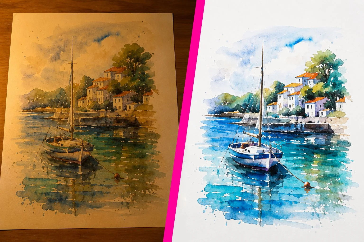
An extreme example, but shows the difference that good lighting and a little digital editing can do, compared to the same artwork photographed under a lamp.
The good news is you don’t need expensive software for this anymore either. There are loads of apps and tools now that do a great job, including free ones. Canva, Snapseed, Lightroom and even the built-in editing tools on most phones are usually more than enough for basic adjustments.
But also, please don’t go overboard. I see it often with online work, where saturation has been heavily pushed, than when printed it looks completely different to the original. What looks bright and dramatic on Instagram doesn’t always translate well elsewhere. I’d recommend not trusting your phone screen too much either - different screens display colours and brightness very differently.
Likewise, screens use RGB colour, while printing (usually) uses CMYK inks, so some colours will simply print differently to how they appear digitally. If colour accuracy matters, it’s worth checking your image on another screen before uploading it. The goal is usually to make the photo feel like the real artwork, not a more extreme version of it.
Final Thoughts
Good artwork photography is mostly about:
Good lighting,
Accurate colours,
Keeping things sharp, and
Preserving detail
Not expensive equipment.
Some of the best artwork photos I see are taken on phones near windows with makeshift setups held together by piles of books and a little patience.
And please remember: customers can only judge the version of your artwork they actually see online. Even brilliant work can get overlooked if the photography lets it down.
If you’d like any advice with photographing your work, or need any help with digitally cleaning up your artwork after photographing, I’m happy to help for free as part of a card order. Feel free to contact me anytime. Thanks! Simon