
How To Turn Your Artwork Into Beautiful Greeting Cards
There’s something really satisfying about seeing your artwork transformed into a greeting card for the first time. I’ll always remember my first greeting card back in 2013 (though less said about the design, the better!) Whether you work in watercolour, acrylic, illustration, lino print, appliqué, felt work or something completely different, greeting cards are a fantastic way for sharing your work.
Over the years, I’ve worked with thousands of pieces of artwork, helping artists turn their work into greeting cards. It isn’t quite as simple as shrinking an image and pressing print. Choosing the right artwork, preparing the files properly, thinking about how your cards will be displayed, and even considering the back of cards all make a difference.
If you’re creating your first greeting card range, here are the things I’d recommend thinking about:
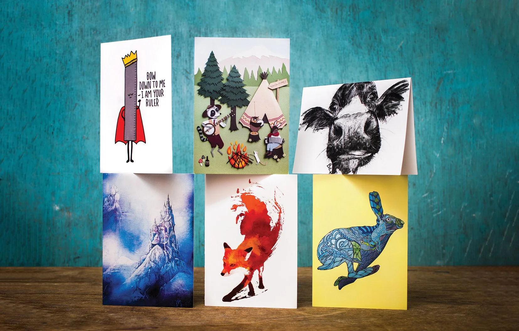
Greeting cards by various artists: Bex Williams, Robert Farkas, Leeann Walker, Lee Vincent
1) Choose Your Strongest Artwork
One mistake I see quite often is artists trying to turn every piece they’ve created into a greeting card. Not every artwork works well once it’s reduced to around 15cm.
Think about how your cards will actually be seen. At a craft market someone might glance at your stall from several metres away. Online, people may be scrolling past dozens of designs in seconds. If your artwork is too busy or doesn’t have a clear focal point, it’s easier for it to disappear into the background.
The strongest greeting card designs are usually the ones that immediately catch your eye. This may be because they have:
a strong focal point
bold colours
simple composition
eye-catching typography or message
or just a distinctive style that makes people stop to look
It’s also worth thinking beyond individual cards and looking at your range or collection as a whole. Does it feel like it belongs together?
The best artists usually have something that’s recognisably them - whether that’s your colour palette, your sense of humour, subject matter or illustration style. It is worth asking what it is about you and your work that is unique? What makes you memorable?
Whatever it is, embrace it. Originality is one of your biggest strengths.
2) Start With The Best Possible File
Even beautiful artwork can produce disappointing cards if the file isn’t good enough. Make sure your artwork is:
High resolution
Sharp and in focus
Photographed or scanned properly
Colour corrected, where necessary
If you’re photographing your artwork, I’d recommend spending a little time editing it afterwards too. Small adjustments to levels, brightness and saturation can make a huge difference in helping the digital image better match your original artwork.
I’ve written a separate blog on photographing artwork, which covers things like lighting, avoiding compressed images, and getting the best possible quality from your phone or camera.
If your artwork is flat and fits comfortably on a scanner, that’s often the better option too. Scanners usually produce very sharp, colour-accurate images from drawings, prints and paintings.
Whatever method you choose, avoid screenshots or images downloaded from social media. They will lose a surprising amount of quality without people realising.
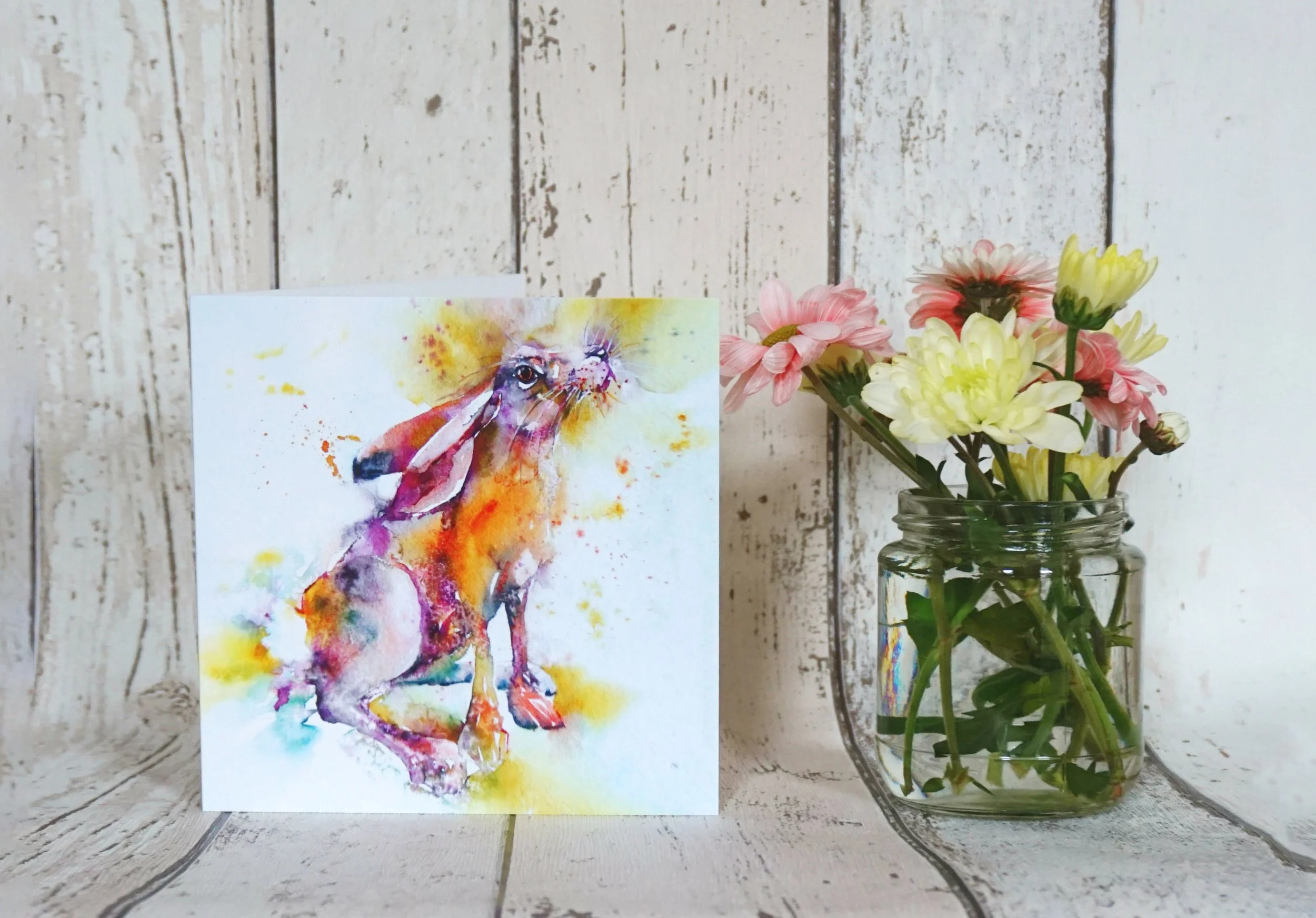
Design by Liz Chadderton
3) Think About Card Size Early
One of the first decisions you’ll need to make is the size and shape of your cards. Some artwork naturally suits square cards, while other pieces work better as portraits or landscapes.
If you’re mainly selling in the UK, card size often isn’t hugely important. Interestingly, that’s not true everywhere - in Germany, for example, square greeting cards cost more to post than rectangular ones, due to their machines!
Other than artwork, where card size matters is in considering how they will be displayed. At markets, cards often overlap in stands. The same applies for gift shops, garden centres and the like, unless they are in spinners. If the title or key part of your artwork sits right at the bottom of the design, there’s a good chance customers won’t see it!
Little details like this can make a surprising difference.
It’s also worth thinking about envelopes and packaging. At CardsBySimon, I use standard industry sizes because they’re familiar to customers and fit the display stands used by many retailers. My 15 × 15cm cards come with 15.5 × 15.5cm envelopes, whilst my 10.5 × 15cm cards use 11.4 × 16.2cm envelopes. They’re a nice snug fit, which also means the cello bags fit properly too.
These standard sizes also make life much easier if you eventually start supplying wholesale customers, as they’ll already have display units designed around them.
4) Don’t Forget The Back Of The Card
The back of a greeting card is often overlooked, but it’s some of the most valuable space you’ve got. At the very least. it’s an opportunity to let people know who created the artwork.
I’d recommend including your artist name (or logo), and ideally a website or social media link so customers can find you again. Some artists also include a QR code, whilst some shops may require a barcode if they’re stocking your cards.
(Barcodes deserve a whole post of their own, so I’ll save going into these for another day!)
Other things you may want to consider:
The artwork title
A small thumbnail
A little story about the piece
Sustainability information
Whether the card is blank inside
At Cards by Simon, I include sustainability information and state that the card is blank as standard, although artists are welcome to personalise the backs however they wish.
If you’re unsure what to include, I’m always happy to help design the back of your cards as part of your order, at no extra cost.
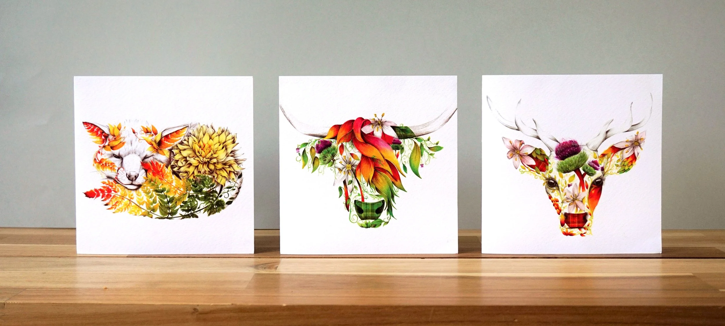
Artwork by Kat Baxter
5) Choose a Board That Lets Your Artwork Shine
Paper is one of those things many don’t think about until they hold the finished card. Then it suddenly matters! :)
There are hundreds of different boards available, all with slightly different finishes, textures and weights. Rather than offering dozens of options, I try and keep things simple at Cards by Simon - every card is printed on a premium 350gm matte board from GF Smith.
I’ve chosen an uncoated FSC-certified board because it produces artwork beautifully, feels premium in the hand, and is easy to write on inside. It has a subtle natural texture without distracting from the artwork, and can be recycled after use too.
Ultimately, the paper should support your artwork, not compete with it.
6) Cellophane or Naked?
There’s no right answer here. Some artists prefer to package every card individually, while others don’t use any wrapping at all.
Cellophane protects cards from fingerprints, moisture and general wear, especially useful at busy markets, farm shops and anywhere customers are likely to browse through lots of cards.
On the other hand, many independent gift shops and online sellers prefer naked cards to reduce unnecessary packaging. It’s really a question of what your values are, who your customers are, and where your cards are being sold.
At Cards by Simon, I offer both standard cello bags and a biodegradable, recyclable alternative for just a little more, for artists who want the protection but with a lower environmental impact. I’m always happy to talk through options if you’re unsure.
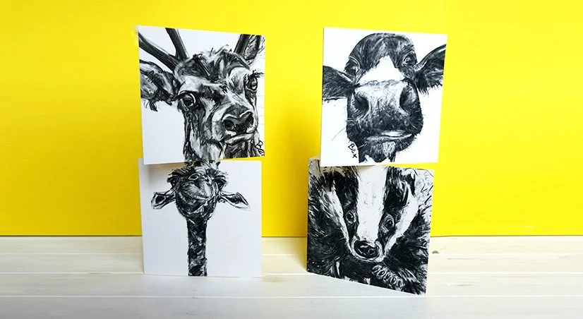
Artwork by Bex Williams
7) Start Small
One of the nicest things about greeting cards is that you don’t need to launch with 50 designs, or 100 cards per design. In fact, I’d always recommend the opposite.
Start with a handful of designs you genuinely believe in, and see how customers respond. Take them to markets; put them online; show them to shops.
You’ll learn far more from selling five designs, than spending months trying to perfect fifty.
That’s why I offer complete flexibility with print runs. You can order as little as one pack of six cards per design, making it easy to test new ideas without filling your spare room with boxes of stock! You can always print more once you know what’s working.
8) Don’t Chase Perfection
One thing I’ve learned is that customers don’t buy cards because every tiny detail is perfect, but because the artwork and/or artist connects to them.
It’s easy to spend months worrying about tiny design tweaks, paper stocks, envelopes etc. Sometimes it’s better to print a small batch, put them in front of real customers, and see what happens.
The feedback you will get from customers is worth so much more than endlessly second-guessing yourself.
Final Thoughts
Seeing your artwork printed as a greeting card for the first time is a great feeling. Whilst seeing a stranger pick it up from a shelf or market stall, smile and decide to buy it never gets old!
If you start with strong artwork, prepare your files properly, and focus on creating something that’s unmistakably yours, you’re already a long way towards building a greeting card range you’ll be proud of.